Dashboard tour
Understand your whole portfolio at a glance: what's healthy, what needs attention, and what's due this week.
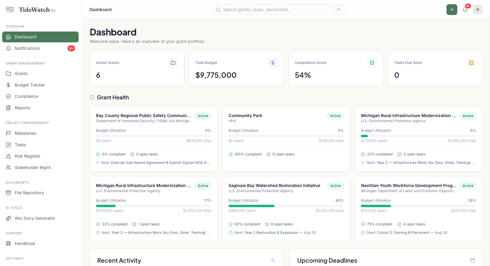
The dashboard is what you should see first every morning. It answers three questions before you finish your coffee: are any of my grants at risk, what's due this week, and what happened yesterday.
The health cards up top
Active Grants, Compliance Rate, and At-Risk count are the three cards across the top. Green means the whole portfolio is on track; amber or red on At Risk tells you which grant to open first.
The upcoming deadlines list
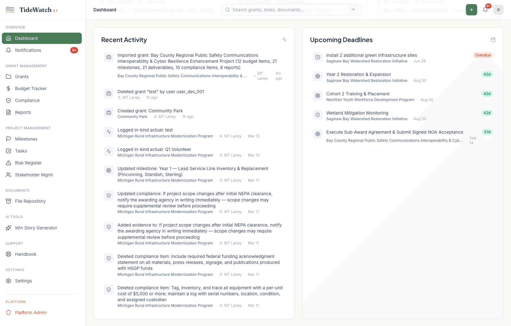
The center panel shows the next 14 days of compliance deadlines, milestones, and reports across every grant. Click any row to jump straight to the item.
The activity feed
On the right, the activity feed shows what changed recently: expenses logged, compliance items completed, team members added. Filter by grant or by user to narrow it down.
Portfolio budget summary
Scroll down for a burn-rate chart across all active grants combined, and a table of each grant with its award, spend, and health status. Sort by any column to find the grant that needs your attention.
Quick actions
The Quick Actions bar in the top-right lets you create a new grant, log an expense, or generate a report without leaving the dashboard. Keyboard shortcut: press Cmd+K (or Ctrl+K on Windows) for the command palette.